
티스토리 뷰
!pip install plotlyhtml로 저장할 때
import plotly.express as px

fig =px.scatter(x=range(10), y=range(10))
fig.write_html("file.html")
sample data
import pandas as pd

d = {'month': [1, 2, 3, 1, 2, 3,
               1, 2, 3, 1, 2, 3],
     'label': ['a', 'a', 'a', 'b', 'b', 'b',
               'a', 'a', 'a', 'b', 'b', 'b'],
     'value': [100, 105, 200, 205, 300, 100,
               200, 105, 400, 705, 900, 1000],
     'code': ['abc', 'abc', 'abc', 'abc', 'abc', 'abc',
              'xyz', 'xyz', 'xyz', 'xyz', 'xyz', 'xyz']}
df = pd.DataFrame(data=d)
df['plotly_tag'] = df['code'].map(str) + '-' + df['label'].map(str)
df
가장 빠른 방법
import plotly.express as px

fig = px.bar(df, x="month", y="value",
             color="plotly_tag",
             barmode = 'group')

fig.show()
go를 이용하는 방법 (위와 동일한 결과)
import plotly.graph_objects as go
fig = go.Figure()

for contestant, group in df.groupby("plotly_tag"):
    fig.add_trace(go.Bar(x=group["month"], y=group["value"], name=contestant,
      hovertemplate="plotly_tag=%s<br>month=%%{x}<br>value=%%{y}<extra></extra>"% contestant))
fig.update_layout(legend_title_text = "plotly_tag")
fig.update_xaxes(title_text="month")
fig.update_yaxes(title_text="value")
fig.show()
차이점이라면 2개만 선택했을 때 express는 박스 크기 고정인데 graph_objects는 자동으로 크기가 조절되어 더 보기 좋음.
| express | graph_objects |
 |
 |
bar plot + line plot
import plotly.graph_objects as go

fig = go.Figure()

for contestant, group in df.groupby("plotly_tag"):
    fig.add_trace(go.Bar(x=group["month"], y=group["value"], name=contestant,
      hovertemplate="plotly_tag=%s<br>month=%%{x}<br>value=%%{y}<extra></extra>"% contestant))
fig.update_layout(legend_title_text = "plotly_tag")
fig.update_xaxes(title_text="month")
fig.update_yaxes(title_text="value")

for contestant, group in df.groupby("plotly_tag"):
    fig.add_trace(go.Scatter(mode='lines+markers', x=group["month"], y=group["value"], name=contestant,
      hovertemplate="plotly_tag=%s<br>month=%%{x}<br>value=%%{y}<extra></extra>"% contestant))

fig.show()
다른 데이터 유형
d = {'month': [1, 2, 3, 1, 2, 3],
     'a': [100, 200, 300, 200, 400, 900],
     'b': [105, 205, 100, 105, 705, 1000],
     'code': ['abc', 'abc', 'abc', 'xyz', 'xyz', 'xyz']}
df = pd.DataFrame(data=d)
df['c'] = round((df['b']/df['a'])*100)
df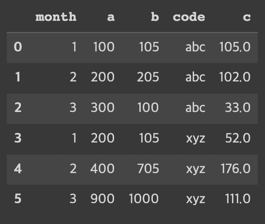
위 데이터와 비교했을 때 label 컬럼이 있고 a값, b값으로 나뉘어져있었는데(melting)
새로 만든 데이터는 label 컬럼이 없어지고 a컬럼, b컬럼이 생김.
달성률 계산을 위해 b컬럼/a컬럼*100한 값인 c컬럼도 생김.
import copy

fig = go.Figure()

df_a = copy.deepcopy(df)
df_b = copy.deepcopy(df)

df_a['code'] = df['code'].map(str) + '-' + 'a'
for contestant, group in df_a.groupby("code"):
    fig.add_trace(go.Bar(x=group["month"], y=group["a"], name=contestant, text=group['a'],
      hovertemplate="code=%s<br>month=%%{x}<br>value=%%{y}<extra></extra>"% contestant))
fig.update_layout(legend_title_text = "code")
fig.update_xaxes(title_text="month")
fig.update_yaxes(title_text="value")


df_b['code'] = df['code'].map(str) + '-' + 'b'
for contestant, group in df_b.groupby("code"):
    fig.add_trace(go.Bar(x=group["month"], y=group["b"], name=contestant, text=group['b'],
      hovertemplate="code=%s<br>month=%%{x}<br>value=%%{y}<extra></extra>"% contestant))
fig.update_layout(legend_title_text = "code")
fig.update_xaxes(title_text="month")
fig.update_yaxes(title_text="value")

# fig = px.scatter(df, x="month", y="a", text="c", log_x=True, size_max=60)
for contestant, group in df_b.groupby("code"):
    fig.add_trace(go.Scatter(mode = "text", x=group["month"], y=group["b"], name=contestant, text=group['c'], textposition="top center",
                             hovertemplate="code=%s<br>month=%%{x}<br>value=%%{y}<extra></extra>"% contestant))
fig.show()

text annotation: https://plotly.com/python/text-and-annotations/
반응형
'시각화' 카테고리의 다른 글
| Streamlit 으로 모델 분류 모델 Inference 하기 (feat. SHAP) (1) | 2024.10.13 |
|---|---|
| Streamlit 알아보기 (2) (0) | 2024.05.25 |
| Streamlit 알아보기 (1) (0) | 2024.05.25 |
| mdates를 이용해 Matplotlib의 DateTime 눈금 빈도를 변경하는 방법 (0) | 2023.05.02 |
| matplot 기초 (1) | 2022.11.26 |
댓글
- Total
- Today
- Yesterday
공지사항
최근에 올라온 글
글 보관함